Brand identity & digital design
KRL VISUALS
- Role
- Concept, Image Production, Design & Development
- Type
- Self-Initiated Business
- Year
- 2025
Overview
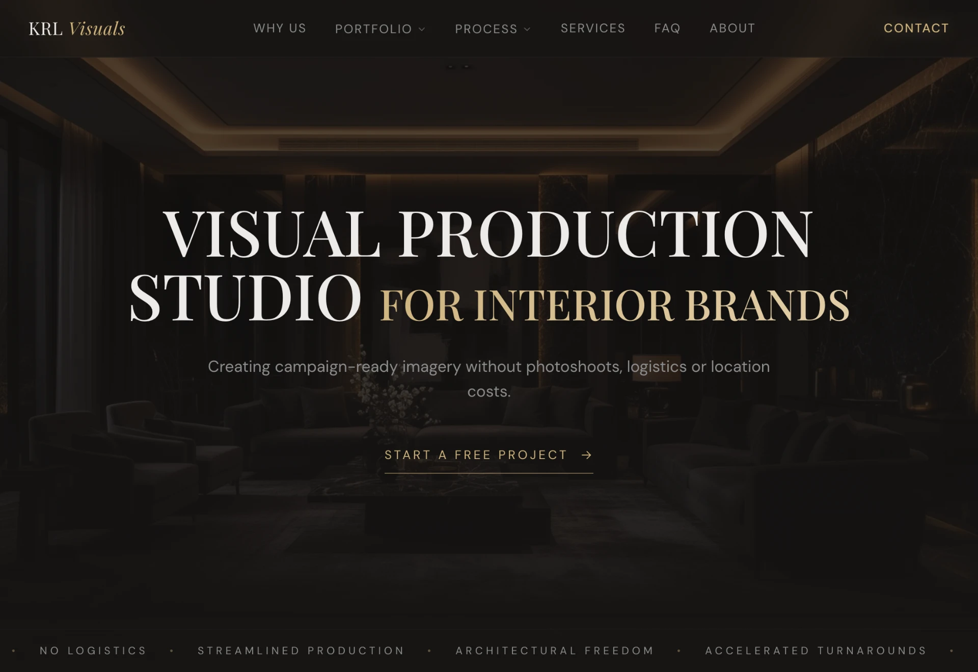
KRL Visuals is a self-initiated brand and digital experience project exploring how AI-assisted image production can be positioned as a premium service for interior brands.
The challenge was to build trust in AI-generated imagery while maintaining a credible and high-end brand perception through identity design, art direction and website experience.
Visual Direction
The visual identity was designed to balance innovation with credibility. A restrained colour palette, editorial typography and generous whitespace create a premium framework that positions the studio as a professional creative service.
-- Colour palette
Gold
Accents & details
#CFB37D
Charcoal
Base surfaces
#161413
Warm white
Backgrounds & text
#ECEBE9
Grey
Secondary text
#8C8C8C
Champagne
Soft highlights
#CCBDA3
-- Typography
Playfair Display
Headings — Serif / Regular 400
Playfair Display was selected for its editorial character and sense of refinement. Its high-contrast forms create a premium presence that helps position the studio alongside established creative and luxury-focused brands. The typeface adds personality without relying on decorative elements, reinforcing both credibility and sophistication.
DM Sans
Body text & navigation — Sans-serif / Regular 400
DM Sans provides clarity and structure across navigation, body copy and supporting information. Its clean and contemporary appearance balances the expressive serif, ensuring the experience remains accessible, readable and professional at every touchpoint.
-- Design principles
The visual system is guided by three core principles that informed every design decision, from branding and typography to layout and user experience.
Trust Through Transparency
The identity prioritises clarity over complexity. Clear communication, consistent hierarchy and visible process explanations help build confidence in a service centred around AI-assisted image production.
Premium Restraint
Rather than relying on decorative elements, the brand uses whitespace, refined typography and a restrained colour palette to create a sense of quality and sophistication.
Editorial Clarity
Content is structured using strong hierarchy, generous spacing and clear visual relationships, making information easy to navigate while maintaining a premium aesthetic.
Digital Experience
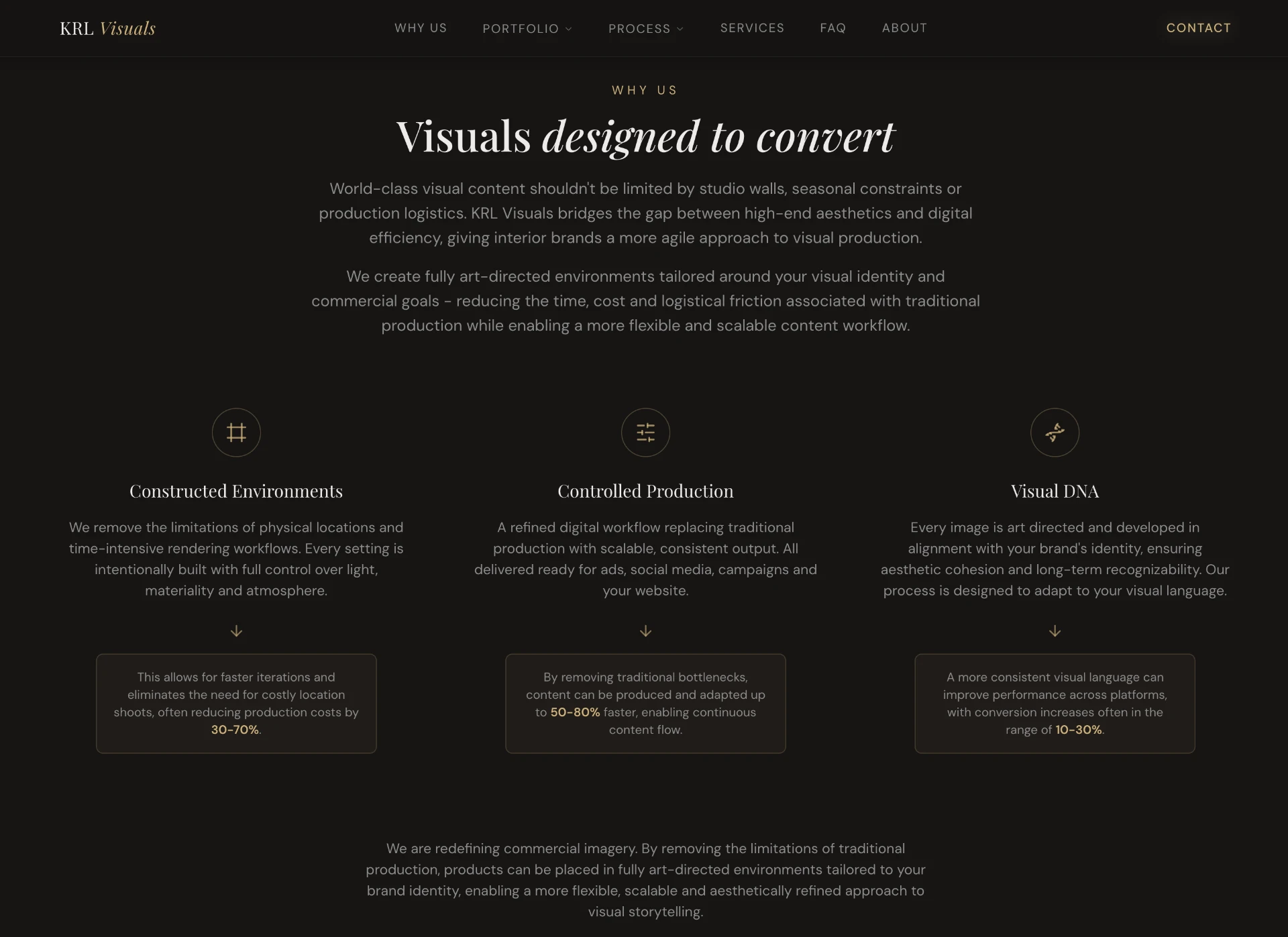
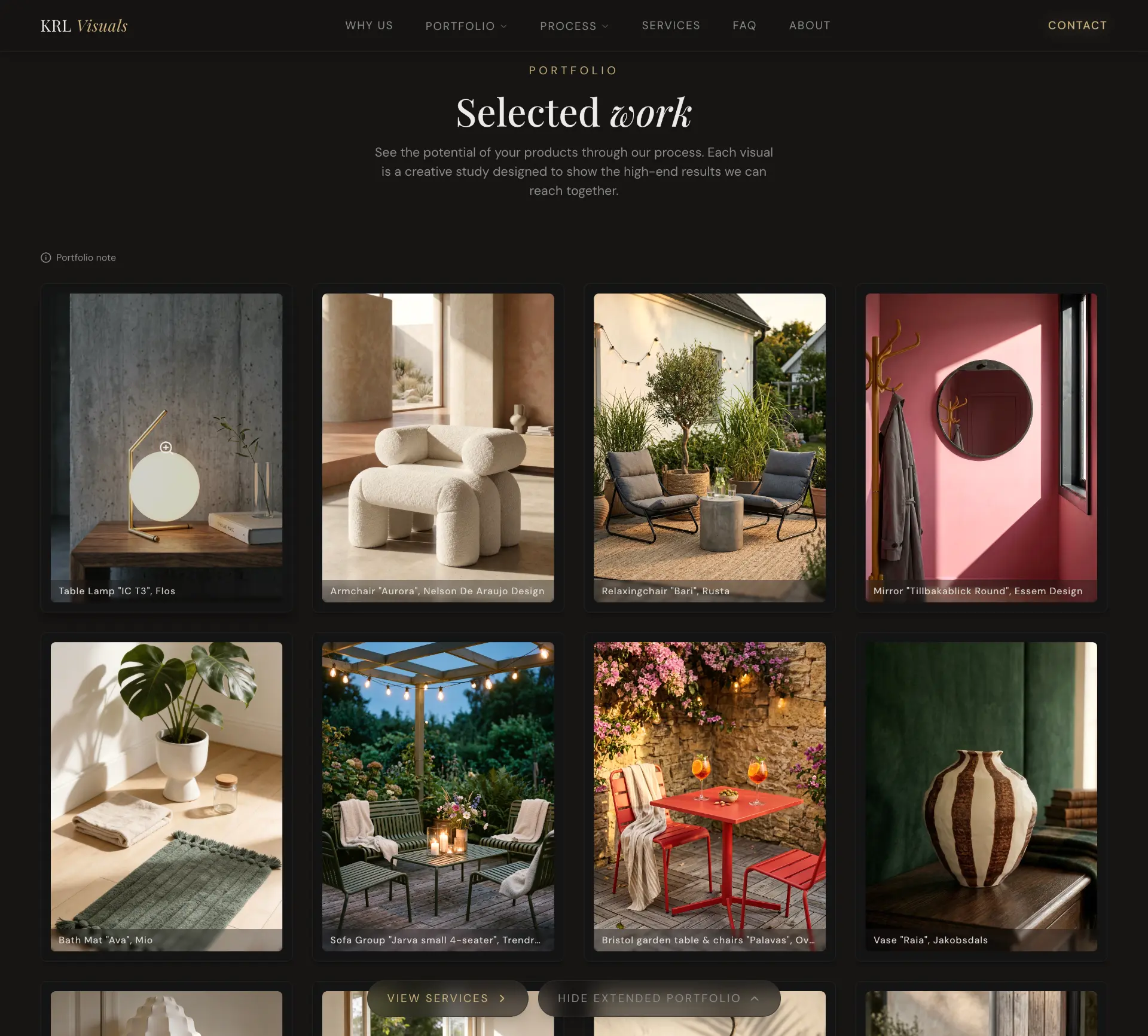
The structure was designed to reflect how potential clients evaluate a creative studio. Rather than presenting services first, the experience begins with visual work, builds trust through process and expertise, and ends with a clear path to enquiry.
From the opening impression to the studio’s approach and contact, the focus is on making the work visible and the next step clear.
Information architecture
Website Structure & User Flow
01 — Attraction
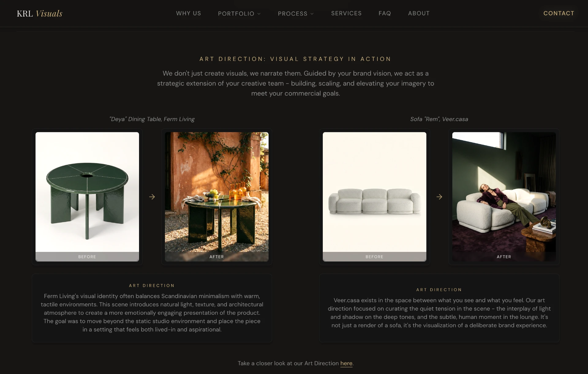
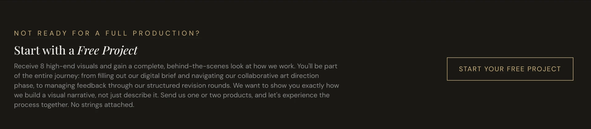
The experience opens with large-scale imagery and a concise value proposition, establishing the studio's aesthetic and positioning from the first interaction. A prominent "Start a Free Project" CTA serves as a low-barrier entry point, encouraging engagement before any commitment is required.
02 — Trust Building
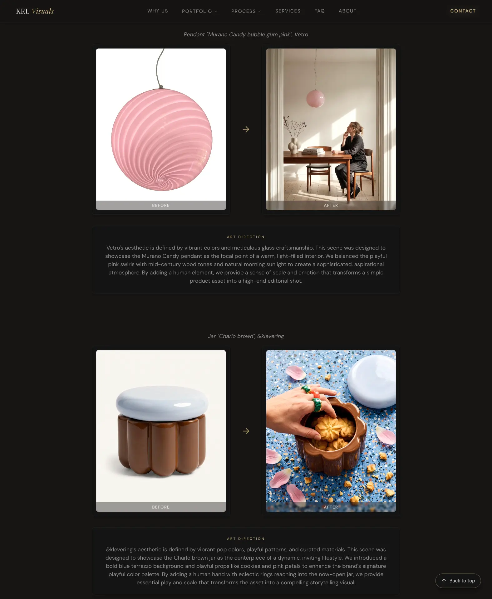
The "Why Us" section and selected projects work together to build credibility. Rather than relying on claims alone, the website demonstrates visual quality through real-world applications and clearly communicates the strategic thinking behind the imagery. This helps visitors understand that the work is not simply AI-generated, but art directed and created with a defined brand purpose.
03 — Decision Making
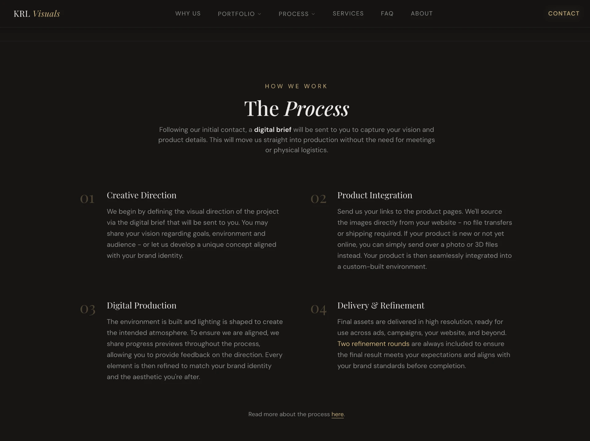
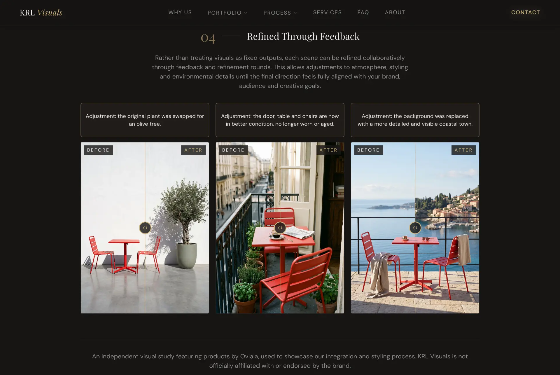
Art direction examples, process breakdowns and the free project initiative reduce uncertainty by making the workflow transparent. By showing both the creative approach and the collaboration process, visitors can better evaluate whether the studio is the right fit for their business.
04 — Conversion
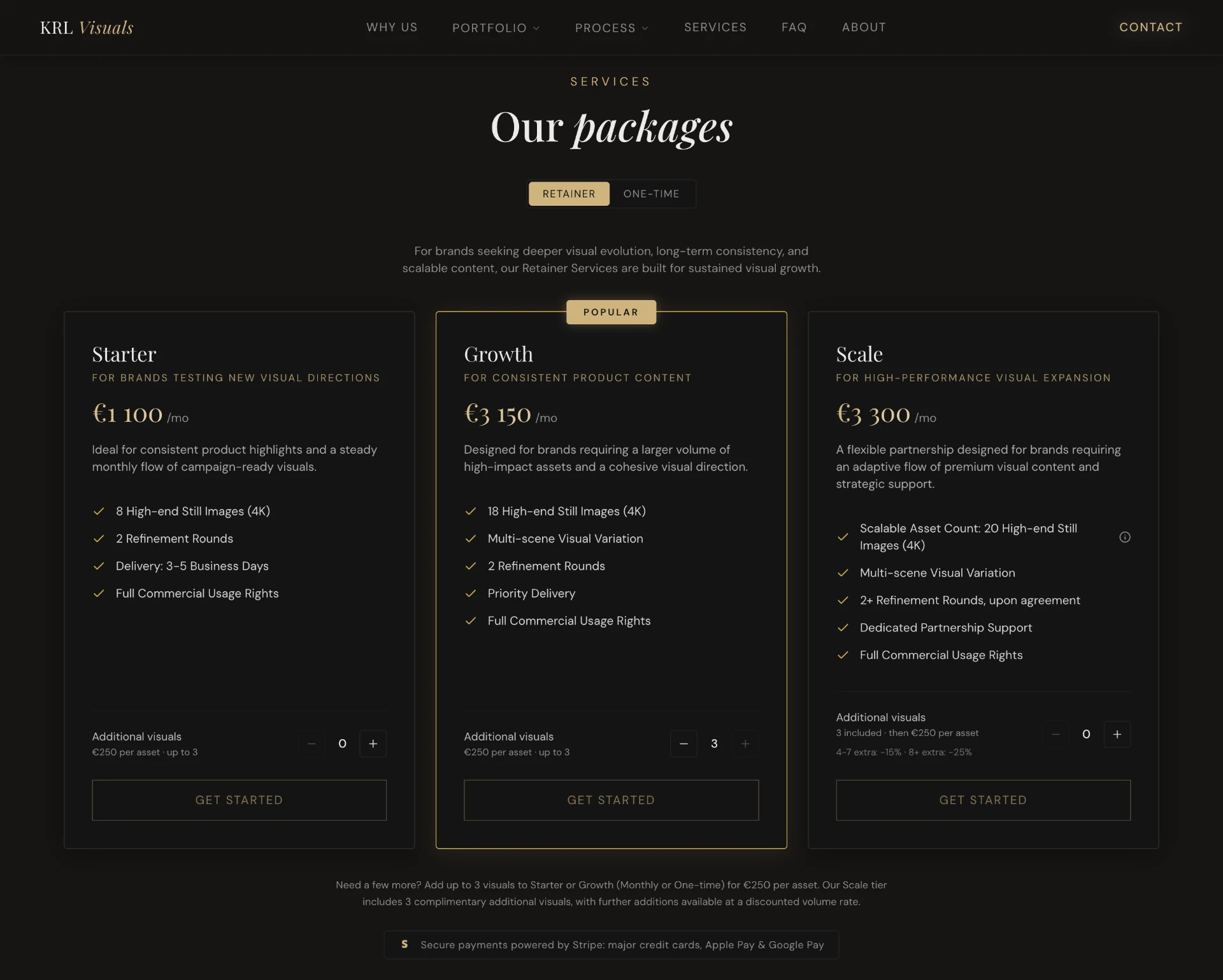
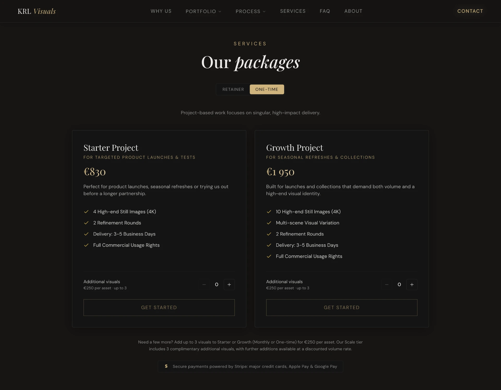
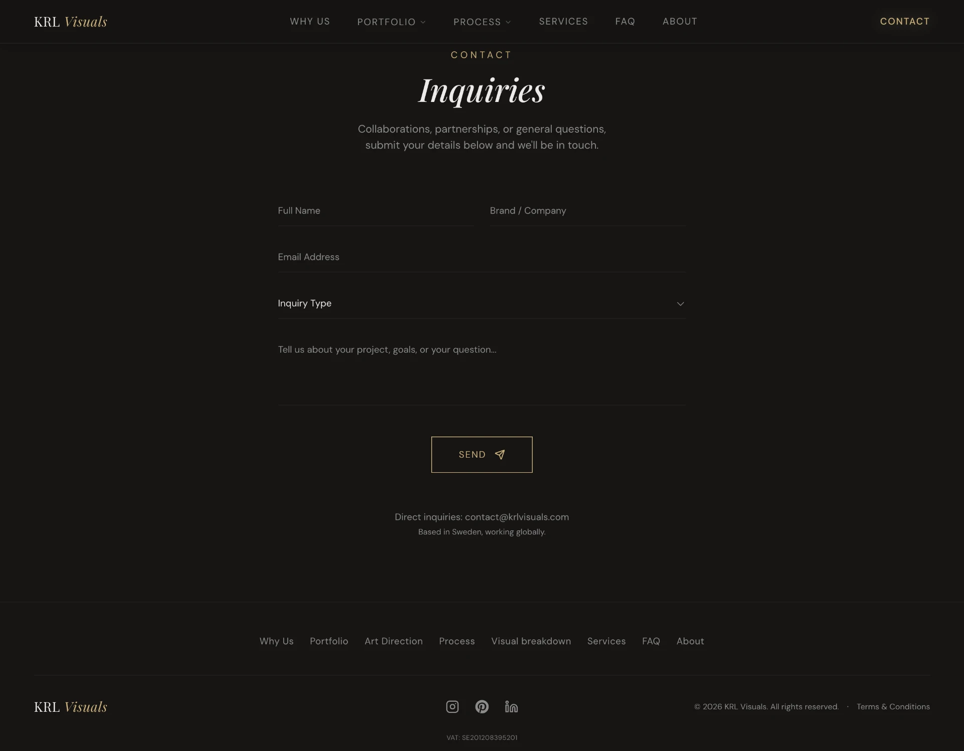
Packages and contact sections provide a clear path from interest to action. Pricing structure, service scope and contact options are presented with minimal friction, helping potential clients move confidently from consideration to enquiry.
Results and reflection
The project showed me the importance of designing around purpose rather than aesthetics alone. Every decision, from structure and content hierarchy to imagery and interaction, was shaped by how the website needed to communicate the brand.
KRL Visuals became more than a visual identity project. It was an opportunity to explore how brand, imagery and interface can be developed as parts of the same system.
Throughout the process, I learned how to structure a website around its intended purpose rather than individual pages or features. Establishing a clear hierarchy, defining what information mattered most, and creating a flow that supported user understanding became just as important as the visual design itself.
The project strengthened my understanding of how content, layout and visual direction work together to create a good digital experience.